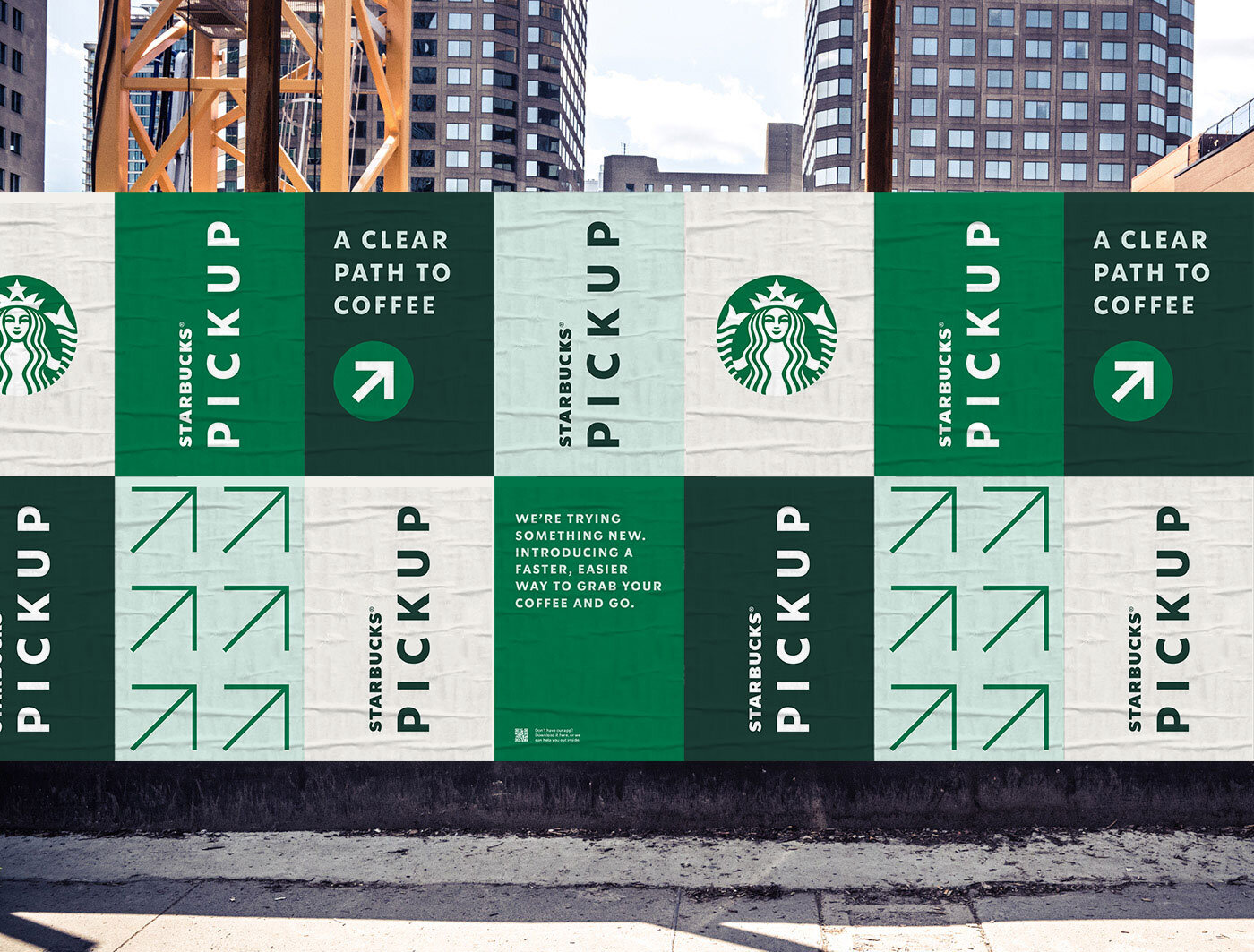
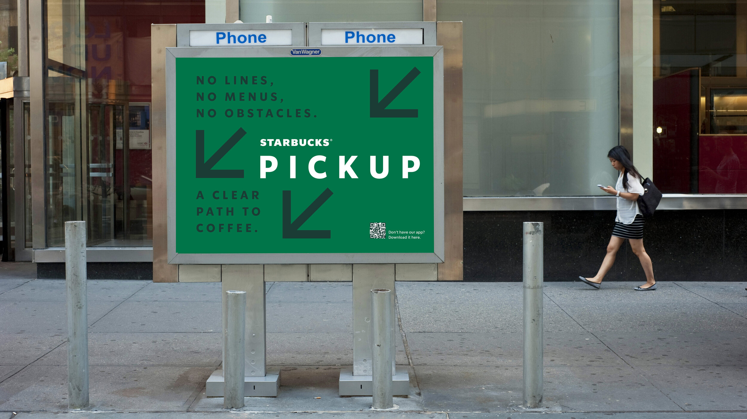
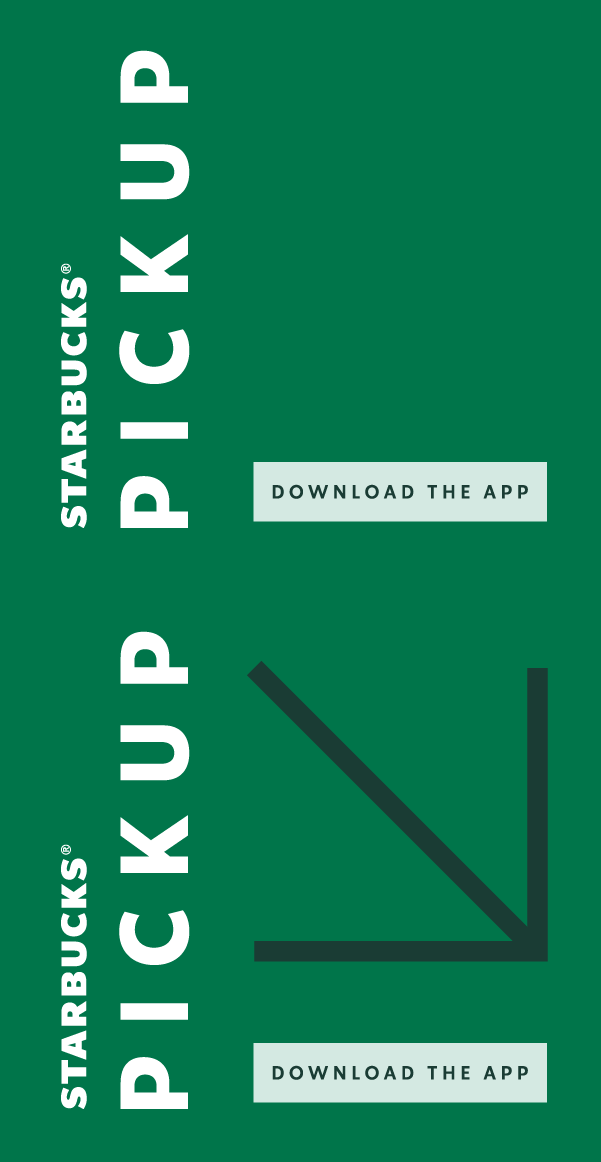
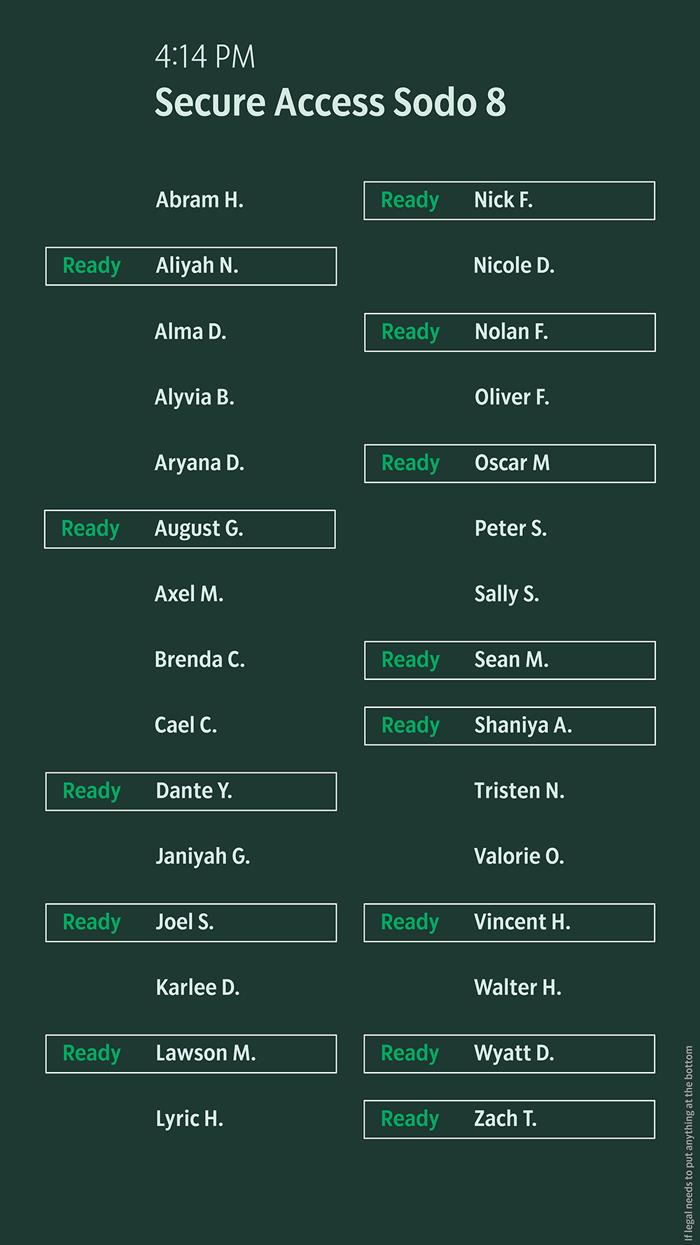
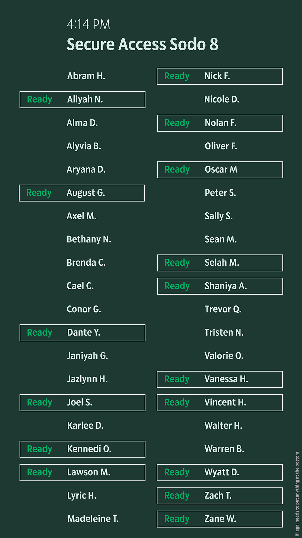
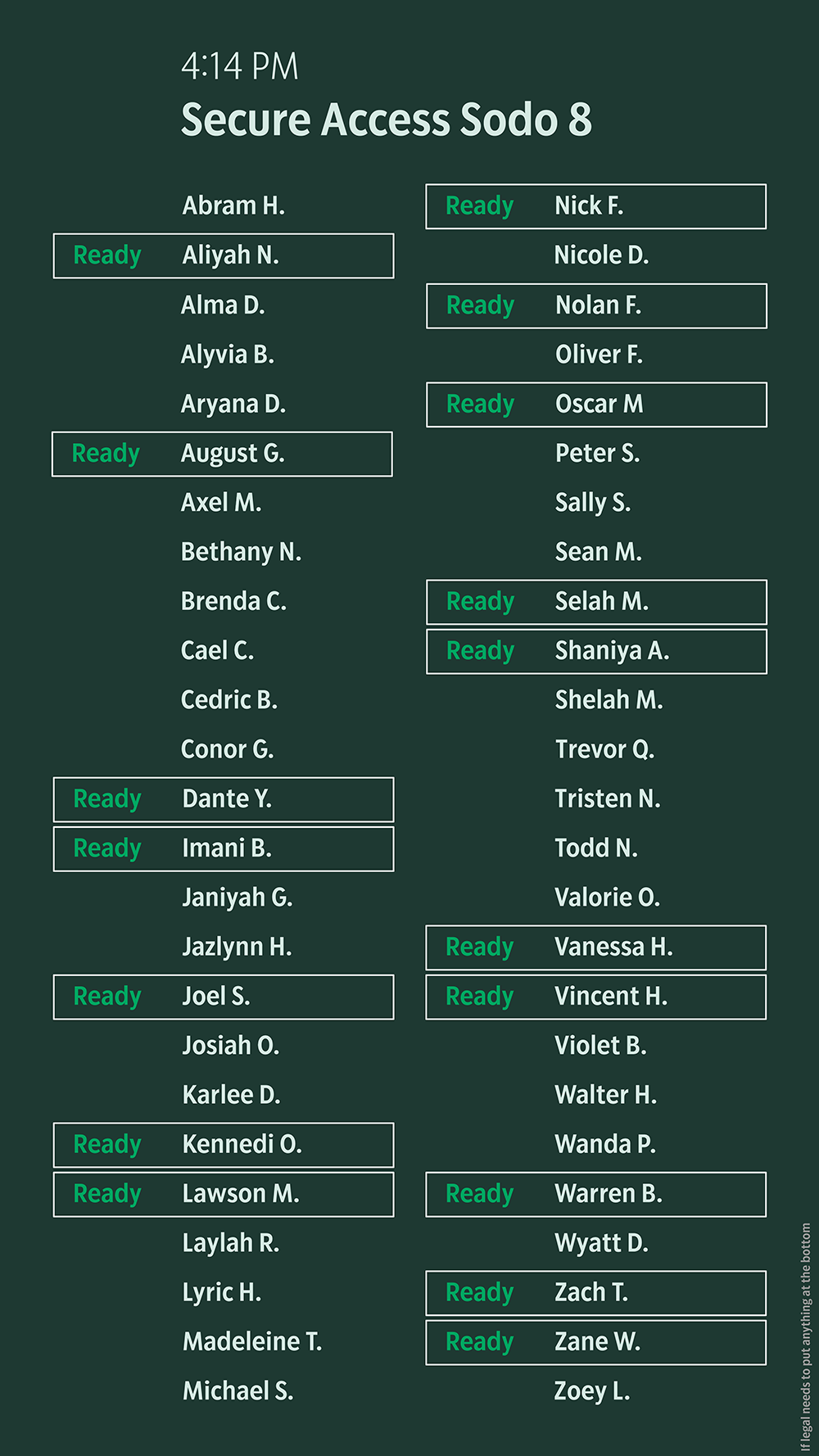
Starbucks Pickup reimagined the Starbucks Experience to elevate the brand and improve total contribution to our challenged urban portfolios. The Starbucks Pickup identity needed to reflect the store experience—simple, streamlined and easy to understand. This was a new behavior for customers, and a new direction for us.
Starbucks Pickup Branding and Store Experience
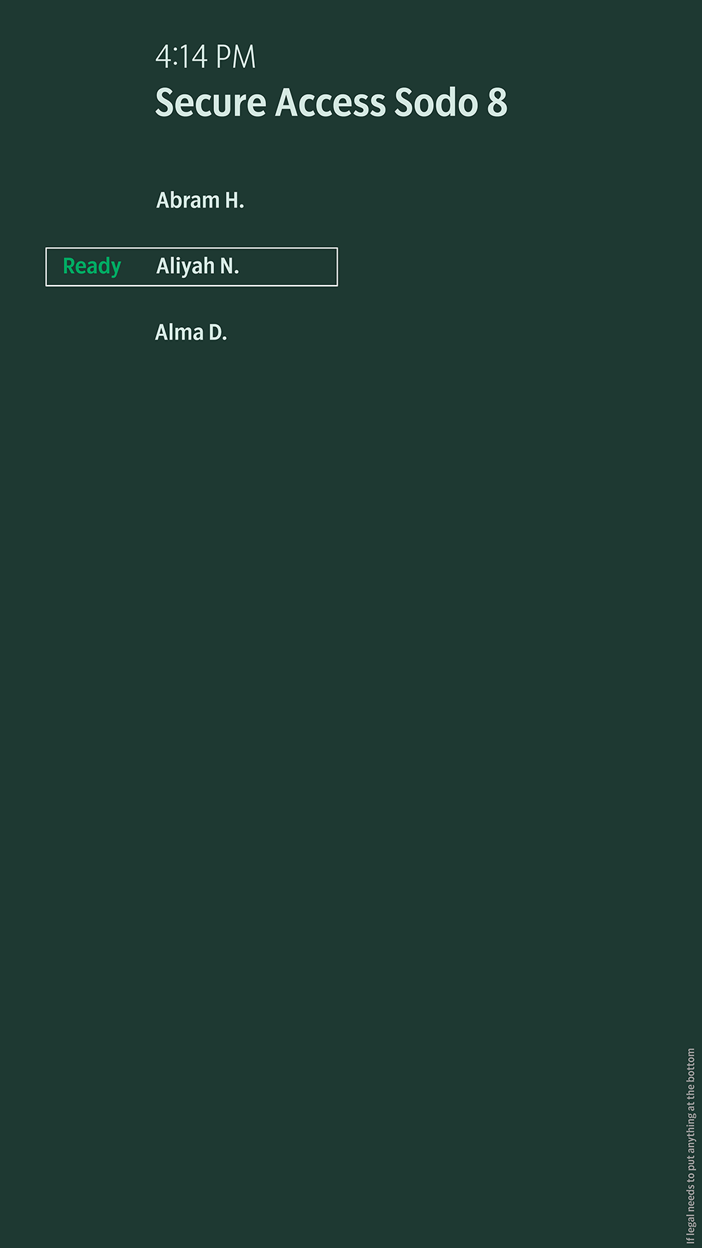
DIGITAL ORDER SCREEN PROBLEMS TO SOLVE
Let the customer know when their order is ready to be picked up 2. Reduce anxiety that a customer’s order has not been received or that they’re at the wrong store 3. Reduce crowding at the hand-off plane
digital order screen Design Goals
1. To support 50 orders / half hour
2. To achieve design continuity with the Starbucks brand
3. A customer can know the status of their order as quickly as possible
4. Have an inclusive design that exceeds accessibility standards
5. To promote an atmosphere of calmness in the store


